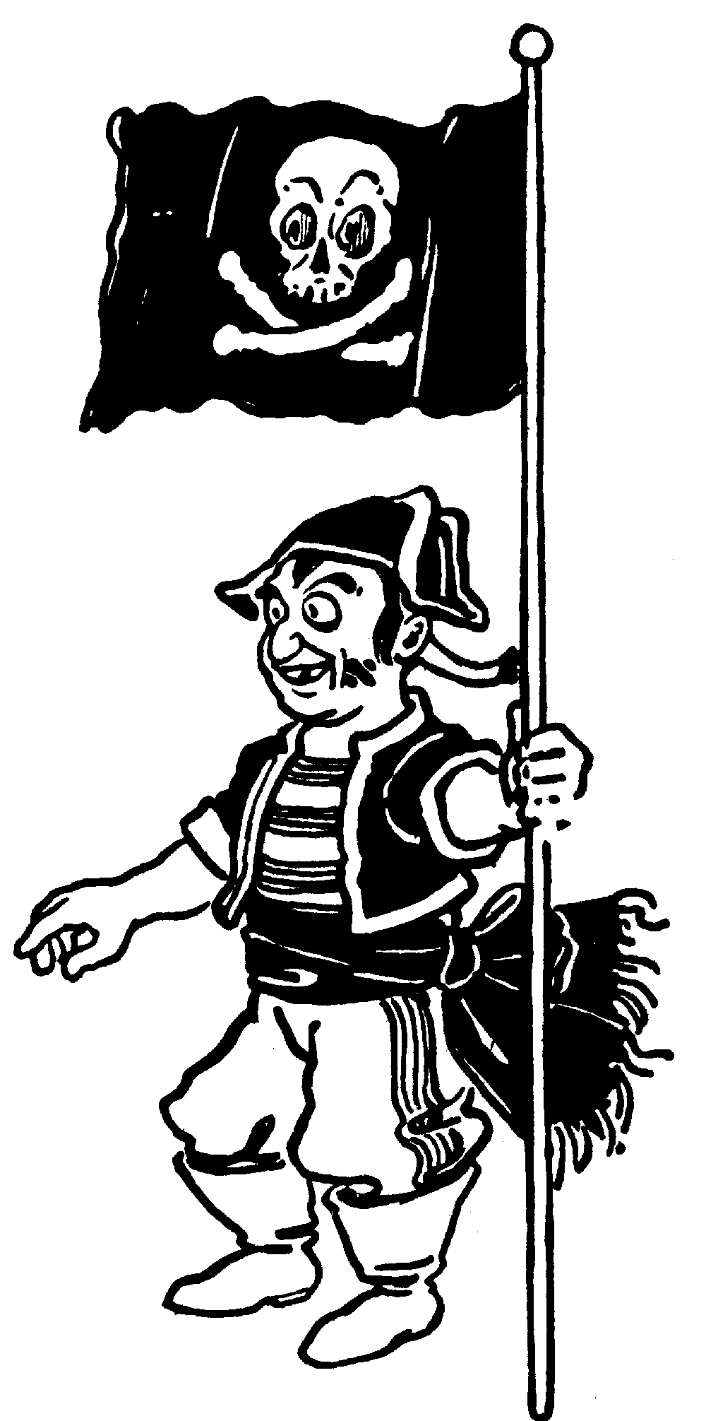
Showing posts with label W. W. Denslow. Show all posts

Friday, July 6, 2018

Evelyn Copelman in the Tiger Den!

There's nothing better to motivate one to get back to blogging than a new treasure to share! And this time it's a painting by an Oz artist I never had much thought of acquiring, Evelyn Copelman, the second major illustrator of The Wizard of Oz.

Watercolor by Evelyn Copelman.

Alas, the painting isn't from Wizard, but a watercolor of a country street scene. The image is a bit larger than 8" x 11", signed at the bottom right in pencil.


For those of you not acquainted, Evelyn Copelamn was the first illustrator to reillustrate a full-length edition of The Wizard of Oz after W. W. Denslow. After World War II, Wizard publisher Bobbs Merrill wanted a new edition of Wizard. The MGM film had made the book more popular than ever,  and the original Denslow illustrations were difficult to make attractive. The first edition of Wizard is stunning, but by 1903 Denslow's art was already suffering from cheap and simplified printing. By the 1920s and '30s the book was decidedly unattractive.

In 1944, Bobbs Merrill decided on a major overhaul and hired Evelyn Copelman to reillustrate the book. It was her first book illustration job. In the printed book the publisher slyly suggests the drawings are based on those of Denslow, but they are clearly much more inspired by the MGM film.

Copelman's line drawings (actually scratchboard work) in the early printings are sometimes a bit stiff and often overworked. Her paintings are much better. A few years after this new edition of Wizard was released, Copelman went back and redrew almost every image and added several new color plates, creating a much more handsome volume.

In 1947, Bobbs Merrill asked Copelman to reillustrate Baum's The Magical Monarch of Mo. She's become a much more gifted illustrator by this point, too, though her style is at odds with Baum's text. (You can read my analysis here).

However, one can see more stylistic parallels between my newly acquired painting and her Mo watercolors than one can find when examining her Wizard paintings - such as in the Mo frontispiece below.


Frontispiece of THE MAGICAL MONARCH OF MO by Evelyn Copelman.

Note how much looser her style has become in the watercolor sky above, and the similarity in technique of the forested hills at the left in the distance.

But even more similarities can be seen with my painting and the most important work of her career - illustrating the Sally, Dick, and Jane school readers!

Illustration from WE COME AND GO (1946-'47) by Evelyn Copelman as "Eleanor Campbell."

Looking at the lovely watercolored grass, the trees across the road, one can imagine Sally, Dick, and Jane walking down the country street scene in my painting. Evelyn Copelman did all of her school reader work under the pseudonym Eleanor Campbell.

Well, that's it for today in the Tiger Den. "See David Blog. Blog, David, blog!"


Friday, February 8, 2013

Drink Your Juice!

Happy February! We have an especially attractive TIGER TALE this month over on the main website - it's  Duffy's Apple Juice Imp, by W. W. Denslow - a rollicking poem with a half dozen fine drawings by Denslow in color! Come check it out!


I also wanted to share the news that the incredible and extremely over-sized edition of Eric Shanower's Forgotten Forest of Oz is now out of print. We shared the news on our Facebook page last week and every copy we had left sold in a couple hours.  We do still have copies of the two Little Adventures in Oz Volumes though - and Forgotten Forest is available in Volume two. Click here to order a copy

Lastly, I know a good many of you are still planning on coming to this summer's Winkie Convention and I urge you to get your registrations in as soon as possible - especially if you want to stay on-grounds at Asilomar. We have a lot of new people coming this year and we have a limited opportunity to request more rooms for Winkies. You can learn more about this year's con from our WINKIE page and you can download info and registrations forms via the link below.

Monday, April 30, 2012

Map of Oz Monday - the 1921 Game Board Map

Last week we looked at Reilly & Lee's 1920 promotional Oz map. Since I am trying to tackle the various Oz maps in chronological order, we've come to a very unusual map - perhaps not even a map at all in the big scheme of things. Yet it offers some points of interest - and it's very beautiful, too.

The Wonderful Game of Oz Map (1921) - Click to Enlarge

This is the board game for Parker Brothers' 1921 Wonderful Game of Oz. At first I didn't think I'd have much to say about this map, but there are a few things to point out. Most obviously this map presents Oz as a squarish country - much like the 1909 Fairylogue map - but I am fairly certain that Oz has gone square simply to accommodate the traditional shape of this sort of game-board. The shapes of the countries are clearly based on the shapes from the 1914 Oz maps (note the phallic pan handle of the Gillikin Country).

But there is a huge adjustment to this map that I'd not really considered before. The Munchkin and Winkie countries have been flipped to reflect traditional east/west positions. Both the 1914 map and the 1920 map show the Munchkins on the left (though of course those two maps disagree about where east is located on the compass). The game designer clearly knew that the Munchkins should be in the east as Baum always stated, and the designer made it so. Perhaps a brave choice, since it flew in the face of the 1920 map issued by the Oz book publisher only the previous year.

The map is also the first to show locations from almost all of Baum's Oz books. The only book not represented on the map is Glinda of Oz - there are no Skeezers or Flatheads, even though there is plenty of room for them. This makes me question when the game was being designed. Perhaps the project was begun before the publication of Glinda in the fall of 1920? I don't really know how long games were in the publication pipeline back then. Of course the Skeezers were on the 1914 map - one of the locations Baum had added to the map that he had not yet written about. So this is in fact an omission. So whether the game designer had never seen a copy of Glinda or the game was designed before Glinda's publication, we will likely never know.

Several of the locales on the map are of interest because they show us things seldom pictured in the actual Oz books - such as this full color view of the Tin Woodman's all-tin castle. This is an adaptation of Neill's drawing of the castle from The Road to Oz (1909), but I think it's neat to see it in color

The Tin Woodman's Tin Castle.

Below is a rare view of Professor Woggle-Bug's Royal Athletic College. Note the imposing statue of the esteemed insect on the point of the roof! And I love the giant mortar-board on the large dome, too.

The Royal College of Athletic Arts and Sciences.

The game-board also offered the best view we ever had of Glinda's Castle until Eric Shanower's Blue Witch of Oz.

The Castle of Glinda the Good.

There are many neat spots to explore on this game-board map. It shows so much care and love for the Oz books that I find it impossible that the designer was not a HUGE Oz fan. I wish we knew who he or she was. Another interesting point is that this map unifies the Oz series. It features the locales from The Wizard of Oz which my readers know was published by a different publisher than the rest of the Oz books. Note the Denslow-like Hammerhead to the left of Glinda's castle.

Here's one more curious spot. On the edge of the lake there is an imposing pink structure not referenced in the Oz books. I wonder what it was supposed to be? The pointy end of the lake and the anthropomorphized big tower almost look like a face and word-balloon.


That's about it for this week's map blog. But if you find this game-board intriguing and would like a chance to play The Wonderful Game of Oz, why not join us at the 2012 Winkie Convention, July 27-29 in Pacific Grove, California? Because we have a gigantic version of the game set up for your playing pleasure!


You can read all about our giant version of the game at the Winkie Convention on this previous blog post. It's a lot of fun! OK, that's it for this week. Next week we'll be looking at the 1927 Coloring Contest map.

(Click here for the next Oz Map blog post.)

Wednesday, November 23, 2011

White Edition Wednesday - WIZARD


Last week we got an overview of the ever-popular "white editions." Today we begin our look at the books one at a time - beginning, of course, with The Wizard of Oz. This will be the most complicated and lengthiest of these blogs, as this title has more variants and Dick Martin's modifications were much more extreme. The "white edition" shown above was published in 1965. But two other Reilly & Lee editions of Wizard preceded it, and we must pay our respects to them as well.

Martin's jacket for the 1960 Ulrey WIZARD.
The first Reilly & Lee edition of Wizard was published in 1956 and featured new illustrations by cartoonist Dale Ulrey. Her pictures were attractive and were printed in black and red in the early printings. In 1960, soon after Dick Martin started his long association with Reilly & Lee, he drew a new dust jacket design for the Ulrey Wizard. For this 1960 printing, the text illustration colors were modified to help tell the story - just like W. W. Denslow had done in the original 1900 printing. Blue in the Munchkin Country, red in the Poppy Field, green in the Emerald City, etc. I am fairly certain this ink color change to the Ulrey illustrations was done at Dick Martin's urging. I doubt anyone at Reilly & Lee even knew of Denslow's original color scheme. Dick was already a major Baum and Denslow scholar, and tweaking the colors like this is exactly the sort of thing he would have done. I also suspect Dick planted the idea that they needed a totally new edition of Wizard featuring the original Denslow illustrations. And in 1964 a new Denslow illustrated edition was published.

1964 "Poster Cover" edition of THE WIZARD OF OZ

For this first printing of the Denslow edition, Dick Martin prepared a lovely cover based on one of the original advertising posters for The Wonderful Wizard of Oz from 1900. Dick also adapted Denslow's 1903 "Poppy Field" endpaper design for the book.

Endpapers of the 1964 Reilly & Lee "Poster Cover" edition of WIZARD

If you compare these to the original 1903 endpapers, which were printed in red and green, you will notice Dick has redrawn the image and extended it at the bottom by almost an inch to accommodate the Reilly & Lee Oz book proportions. The book retained the afterword by Edward Wagenknecht from the 1956 Ulrey edition and got a new foreword which may have been written by Dick Martin:
"W. W. Denslow, the illustrator, was the perfect collaborator for L. Frank Baum. His pictures could no more be separated from the text than Gilbert's words could be taken from Sullivan's music. The same spirit of fun, surprise and mystery held them both in a rare and happy partnership. This sparkling new edition contains all the best of Denslow's illustrations - including many which have not appeared since the original edition of 1900, and several of which have never before been published."

Looking at the chronology of events, it seems likely that it was Reilly & Lee's pleasure in seeing this spiffy new edition that prompted them to ask Dick to redesign all of the Oz books in a new modern format. Alas, he had given this 1964 edition a very unique cover - a style that would be hard to replicate on thirteen additional Baum titles. So Dick copied the style he'd used on Merry Go Round in Oz for the post-Wizard books, and when Wizard needed to be reprinted in 1965 he designed the new "white edition" cover we all know, as seen at the top of this blog post, to replace the "poster edition."

For the most part the interior of the "white edition" is identical to the earlier 1964 "poster edition." But there were a few changes. The illustration color scheme was improved. In the 1964 "poster edition," the first two 32-page gatherings had blue text illustrations. In the 1965 "white edition," the first 16-page gathering has illustrations printed in gray, better suiting the story. The "white edition's" final gathering of 16 pages also changed to illustrations printed in gray and added eight more pages to the end of the book. To fill these extra pages Dick cut the three-page ad [see comments] listing all forty Oz books as well as two illustrations that appeared in the "poster edition." He replaced them with a multi-page ad - featuring the plot synopses of the Baum Oz books from Who's Who in Oz - plus two additional illustrations. Many copies of the "white edition" Wizard have the Kansas illustrations printed in chocolatey brown rather than gray. The brown can be seen in the illustration of Uncle Henry sitting on the stoop further down this blog.

Before we get into looking at how Dick Martin adapted the Denslow illustrations it is well to point out one feature I only recently noticed. The typography of the Denslow edition is that of the Dale Ulrey edition. Dick Martin simply replaced her illustrations with adapted Denslow illustrations


Note that the text, page numbers, and running titles are identical in both editions. Martin has simply adapted two of Denslow's images to replace those of Ulrey. He also deleted the chapter number. In the foreword quoted above it mentions that this edition includes several illustrations which "have never before been published." That refers to these two images:


The image at left was discovered in a 1954 Metropolitan Life Insurance advertisement. In 1964 Dick still believed this was an unknown Denslow illustration. It isn't. It dates from 1954. The Lion (above right) is from Denslow's 1905 "Scarecrow and Tin Man at the Flower Festival in California" comic page.

It must be pointed out that while I am calling these Denslow illustrations, most of them have been heavily adapted and some have been completely redrawn by Dick Martin. He did this both to simplify Denslow's elaborate two color design and to create images the right shape to fit the Ulrey layout. Let's take a look at some examples:

Original Denslow on left - Dick Martin on right. CLICK TO ENLARGE

Above, you can see how Dick modified Denslow's original illustration to serve as a stand-alone full-page drawing. I like that he preserved Denslow's aesthetics by allowing the sunflower to break through the frame. Yet once one realizes these "white edition" images are Dick Martin tracings it's easy to spot his work. In the right hand picture, the simple, cartoony silhouette of Aunt Em doing dishes is much more Martin than Denslow.

Below are several examples of the clever way Dick cobbled together different Denslow illustrations to meet the needs of fitting into the Ulrey edition typesetting.

Original Denslow on left - Dick Martin on right. CLICK TO ENLARGE
You can see that Dick kept the initial S to start the chapter, but he needed to remove the Munchkin hat and some of the wildflowers. However, the raised position of the S created an empty space above the type, so he replaced the original seated Dorothy with a standing Dorothy pulled from the illustration below.


Dick reused the Toto from this picture on the chapter title below. Note, too, that Dick replaced almost all of Denslow's solid blocks of color with zip-a-tone line patterns. The line pattern was easier to print reliably and probably added a subtly modern feel to the book. 

Original Denslow on left - Dick Martin on right. CLICK TO ENLARGE
Many of Denslow's color plate drawings were reproduced fairly accurately, though printed in a single color. However, the other illustrations were almost all Dick Martin tracings. Sometimes Dick's tracings were quite close to Denslow's original lines. At other times Dick's lines couldn't help but display his own style. And a few times Dick made deliberate changes to Denslow's linework.

W. W. Denslow above - Dick Martin below.

BIBLIOGRAPHIC ODDITIES
This section will be modified as more information on variants comes in

While the 1964 printing of the "poster edition" of Wizard had "poppy field" endpapers, it is probable the earliest printings of the "white edition" also have "poppy field" endpapers. But the vast majority of Wizard "white editions" I have seen have the Road to Oz "crowd of Ozian celebrities" endpapers. (These endpapers were also used in the rest of the "white edition" Oz books.) I'd be most curious to hear what endpapers are in your copies of the Wizard "white edition." If you know when you bought your copy or it has a presentation date, that can be useful information, too. The earliest printings have the front and back cover properly centered. The later printings (probably from the mid-late 1970s) used smaller boards, 6" wide as opposed to the 6 3/8" inches of the earlier printings, as shown below.

Note how the cover on the right is off-center due to the smaller boards.

I have several copies of this book here in the Tiger Den - one of which seems somewhat atypical. I bought it new in 1979 at F. A. O. Schwartz when I was a kid. It has the smaller 6" boards, so the cover doesn't wrap well, but it does have the "poppy field" endpapers printed in black and red and the Kansas illustrations are printed in gray. The smaller board size and known purchase date indicate this is a later printing. So clearly the gray Kansas illustrations and "poppy" endpapers do not automatically indicate an early printing date.

Examples of both the gray and chocolate brown ink colors.

So I'd be most curious if any of you can share info on whether the Kansas scenes in your copy are gray or brown, and if you have Road endpapers or "poppy" endpapers. Also if there are ads in the front or back of the book for either 14 or 40 Oz books. You can leave info in the comments section.

As I mentioned last week twelve of the fourteen "white editions" were also available in paperback form through Rand McNally. Their paperback Wizard printed all of the illustrations in black and white.

That's it for today - next week we'll tackle The Land of Oz!

Wednesday, November 2, 2011

Painting Pictures with John R. Neill

A neat item arrived in today's mail. Technically it belongs to Eric, but he said I could blog about it. It's a full page of John R. Neill art printed in the Philadelphia North American for a coloring contest. It's pretty early in Neill's career, too, dating from April 20, 1902, two full years before he illustrated his first Oz book, The Marvelous Land of Oz, in 1904.

This particular example of the North American children's page came with "paints" printed on the page so children could color the image. The "paints" really work - you just use water and a brush to activate the color spots and you're ready to go! Luckily the child this paper was delivered to got bored after sloppily painting a bit of blue on one little girl.


Neill did a number of these paintable pictures and W. W. Denslow did a few paintable Billy Bounce comic strips, too. It seems to me newspapers were a lot cooler 110 years ago.

Wednesday, August 24, 2011

Denslow in Egypt

One of the pleasures of attending World Con last week was the chance to browse the bookshelves in the Dealers Room. I found several neat little books and quite a few more books at a couple bookstores and antique shops on the drive up and back.

One of the books from World Con proper was Enoch the Philistine by LeRoy Hooker published by the Rand McNally Co. in 1898. I bought it because it features a rather elaborate cover design by W. W. Denslow, illustrator of The Wonderful Wizard of Oz.


I have a number of books with Denslow covers, but what struck me about this one in particular is the unusual use of a second cloth to create part of the image. The royal blue evening sky is created by applying a blue cloth over the desert brown cloth. There is also quite a bit of gilt stamping: the title and author's byline, the stars at the top, and the comet on the back.There are also four stamping colors in addition to the gilt: dark blue, bright green, a bloody brick red, and the light sandy gray of the pyramid which seems a bit faded.

The book is subtitled "A Traditional Romance Of Philistia, Egypt And The Great Pyramid." The announcement in Publisher's Weekly of November 5, 1898, says, "the story of the spiritual significance of the Great Pyramid is supposed to be told in the words of Enoch, a shepherd of Philistia, who superintended the erecting of the monument according to directions supposed to have been found in the Roll of Enoch the son of Cain. This builder was a great astronomer and arithmetician, who also built the great Egyptian canal and changed the current of the Nile. He live to be one hundred and four score years. His tender love for his wife Zillah furnishes the romance of the story, which is really a historical picture of the days of Abraham and Melchizedek."

If by chance that blurb has piqued your curiosity enough to want to read the book, here's a link to a free online version.


Thursday, July 7, 2011

The Pirate DEN

Well guys, it's almost Winkie Convention weekend! Followers of this blog know that our theme is "Oz Under the Sea" and that we're celebrating the centennial of L. Frank Baum's The Sea Fairies and the eightieth anniversary of Ruth Plumly Thompson's Pirates in Oz.

To get things off to a jolly start, this month's Tiger Tale features "The Pirate," an illustrated poem by W. W. Denslow from his book When I Grow Up. Click here to read it and see the pictures.

So, Arrrrr....

Monday, May 23, 2011

Pirates and Mermaids

Original drawing by W. W. Denslow
Well, gosh - what a long time between blogs! I HATE that! Luckily, I have lots of excuses. I've logged almost sixty hours a week at San Diego Opera working evenings on the make-up crew for performances of Carmen and daytime hours painting scenery in the shop. It's nice to have so much work again - but it's NOT good for blogging.

Now, on top of all this I had to get the Winkie Convention Program Book ready for press. It has been a huge job this year as the book is bigger, better, and longer than ever! I'll try to give you a sneak-peek at the cover in the next week or so.

One of the items included in the program book is this original drawing by W. W. Denslow from The Pearl and the Pumpkin (1905). This drawing was used as one of the color plates in the book and it seemed especially appropriate for this year's Winkie Con as we are celebrating the centennial of L. Frank Baum's The Sea Fairies (which is about mermaids) and the 80th anniversary of Ruth Plumly Thompson's Pirates in Oz (which is about pirates) - hence, the appropriateness!

You might find it interesting to compare the original drawing to the printed color plate in the book. Denslow's original art for Pearl and the Pumpkin is very similar in style and technique to his original art for The Wonderful Wizard of Oz. Both feature his bold style and show a couple of the characters breaking thru the frame of the illustrations. It's also interesting to see how Denslow modified the original drawing; he clearly tried several positions for the mermaid's tail. If you click on the image of the original drawing, it will enlarge, and you can see much more pencil detail. Note how some elements of the original line art are printed in a color, not just in black, such as the mermaid's hair and the tattoo on the pirate's arm.

So, the blog is back on track and so is the Winkie Convention. If you aren't already planning to attend this year's best Oz convention why not decide to right now? You can get more information and find a link to download our info-pack and registration materials by clicking here.

Thursday, May 5, 2011

Arghh!

Captain Salt by John R. Neill (1931)
I am most sorry for the minimal blogging of late - alas, I was taken prisoner by a bunch of Pirates!

Well, that's only sorta true. I have been locked below decks finishing the Winkie Convention Program Book for this summer. It must go to press by about May 15th to make sure we have plenty of copies for Winkie Con attendees this July.

The 2011 Program Book will be the thickest and longest yet produced - over 150 pages of Ozzy information, good reading, and oceanic fun. We have contributions by Michael Riley, Judy Bieber, Peter Hanff, Robin Hess, Eric Shanower; and little-known Pirate works by John R. Neill, W. W. Denslow, and Ruth Plumly Thompson.

It also features lengthy interviews with Oz creators Tommy Kovac (Royal Historian of Oz) and Kirk Kushin (OZopolis) and an additional interview with our Ozzy entertainment for Saturday night, Joe Cascone and David Haines of the Toronto Civic Light Opera Company.

Eric Shanower will be doing a full-color painting for the program's front cover and OZopolis cover artist, Sylwia Smerl, has prepared a lovely full color piece for the back!

So, how can you get a copy of this highly-collectible Pirate booty? Well, you'll just have to come to the Winkie Con. Click here for details and registration materials!

Friday, April 22, 2011

Dorothy's Oz book

My BF Eric got a very interesting eBay win in the mail today. It's a first edition of The Wonderful Wizard of Oz, containing first state text and second state color plates. Alas, it is a wreck, it's mostly unbound, it's missing a spine, it's missing three plates - did I mention it's a wreck? No wonder hardly anyone even bid on it.

Anna Laughlin as Dorothy
What makes it especially interesting to me (and makes me glad that this copy has now come to live with us, even if it is technically in Eric's collection and not mine) is that this copy previously belonged to Anna Laughlin who created the role of Dorothy Gale in the 1902 stage musical The Wizard of Oz

The book is signed by Anna Laughlin twice on the front free end paper. The first signature reads: N. Y. City -  S. H. P. May 11, 1902 - Property of Anna S. Laughlin. We don't know who or what "S. H. P." is. Eric chooses to think it is the person that gave her the book. Interestingly, this date of May 11, 1902, is before the show even opened in Chicago, so Anna clearly got the book just before boarding the Chicago train. The Wizard of Oz premiered in Chicago on June 16, 1902.


Anna Laughlin was born October 11, 1885, in Sacramento, California. So she was only sixteen when she got this book and became the first Dorothy. The book is signed a second time with Anna's married name. She married a diamond importer named Dwight Monroe just as she was finishing up her run in The Wizard of Oz. They had one child, Lucy Monroe, who was born on October 23, 1906. Lucy went on to become a popular radio singer. Anna Laughlin died on March 6, 1937.

This book contains one other curiosity. It has Denslow's "Poppy Field" endpapers which were designed for the 1903 Bobbs-Merrill second edition. They seem to have been added to this otherwise first-state Hill printing. Was this a repair job done by Laughlin herself? Did she just adore the new Poppy Field endpapers - the Poppy Scene was a high-point in the show - and get a set from Denslow? Were the Poppy Field endsheets possibly given away as a promotion or on display in the lobby of the theatre in 1903? We'll probably never know. Where this book has been since it left the hands of the first Dorothy Gale is unknown - and how it got so trashed is uncertain. But it has a good home now.

Thursday, March 31, 2011

The Royal Post Office of Oz

A few weeks ago I stumbled across some beautifully produced Wizard of Oz stationery created by 7321 Design.

It is based on illustrations from The Wonderful Wizard of Oz, yet the designers have gone to great lengths, in both research and creativity, to create a very original package. At right you can see one of the envelopes. It is printed to look very old and stained, it has some faint typing in the upper corner, and a faded ink inscription. Both are text from Wizard.


There is also a canceled one-and-a half cent Oz postage stamp in the upper right-hand corner showing the Cowardly Lion. It's pretty cool! That said, it does seem like this letter writing paper is more for one's amusement rather than for actual use. It would be a shame to have to cover up the Oz stamp with a real one, and I don't imagine the U.S. Post Office would honor the Ozzy one either.


The Poppy Field letter writing set (at right) comes with two different paper and envelope designs. The alternate envelope features a monogram inspired by Baum and Denslow's initials in the colophon of the first printing of Wizard as well as more decorative Ozzy writing.

There is also a set of letter-paper featuring illustrations from when Dorothy and her friends arrive at the cottage just outside the Emerald City. It too comes with two letter and envelope designs (see below). The stationery sets also include a set of  red foil letter-seals, each embossed with the Baum/Denslow initial design.


There is also a  greeting card set. It comes with only one card and one envelope - but it's pretty cute! I especially love the visual quote of music from the "Poppy Song" from the 1903 WIzard of Oz musical.

The envelope is decorated with another of the Ozzy postage stamps. The interior of the greeting card is printed with another illustration of the Poppy Field. Instead of the foil letter seal the greeting card comes with an adhesive backed "seal" made of sealing wax (or possibly plastic). It says "The Wonderful Wizard of Oz" in Denslow's own font and features the Lion entwined OZ (see below). Pretty cool stuff!

Tuesday, January 11, 2011

Cats and Dogs

I have always liked W. W. Denslow's illustrations. Even when I was little, I found his work very appealing. He had a uniqueness of vision and a vitality that is very engaging. Over the years I have built up a decent collection of Denslow material, including several original drawings.

A few years ago I was offered an original drawing from Denslow's 1903 picture book The House that Jack Built. I snapped it up. The drawing shows the cat, that caught the rat, that ate the malt that lay in the house that Jack built; as well as the dog, that chased the cat, that caught the rat, that ate the malt ... etc.

In the book (at right) the illustration is printed in color. You will see several modifications in the printed illustration: the line work of the dog is printed in gray, and the square box Denlsow drew has been rendered as a simple orange shape with no outline. In the original (above) you can see the little corner mark Denslow used to indicate where the text should be placed. 

The cat from this illustration was reused on the cover of Denslow's Picture Book Treasury, published in 1990 by Aracde, an imprint of Little Brown and Co. (see below)

So here ends the blog, about the art, that showed the dog, that chased the cat, that caught the rat, that ate the malt that lay in the house that Jack built!

Friday, October 8, 2010

The Little Wizard Strikes Again!

This edition of The Wizard of Oz is even tinier than the one in the blog a few days ago!

This very small hardcover volume measures 3-7/8" by 2-3/4" and it is about 1/4" thick. It was in a bin of assorted Christmas ornaments when I found and purchased it. The only publication data in the book says that it was published by Pleasant Company Incorporated. I think I got it around 1989.

It may have been meant as a Christmas ornament as it does not contain the entire story. But the 45 pages it does contain are a facsimile of late Bobbs Merrill printings. This little volume contains all the pages from the  beginning of the book until page 34 in the chapter "The Road through the Forest."

In any case, it's quite cute! Below you can get a better idea of the actual size of the volume. I know there is a dollhouse-size version of Wizard out there somewhere - but I don't have one!

Tuesday, October 5, 2010

The Little Wizard


I've always thought this edition of The Wizard of Oz was exceptionally adorable. It is the second British edition of Wizard and it was published by Hutchinson & Co. of London in 1926.

While this British edition (shown at right) is almost exactly like the 1920s American edition from Bobbs Merrill (though it has no color plates) what you can't tell from the picture is that this edition is about a third smaller than its American counterpart. It's a very unusual size for an Oz book!

Pictured below are the two editions side by side. I think it's very cute!


Wednesday, August 25, 2010

Don't BLOG a Book by its Cover

Well, actually, that's exactly what I'm gonna do!

Last week I had to purchase a lot of fourteen old books on eBay to get ONE that I wanted. The lot was poorly presented - just titles and a quick, dark photo of all the spines. But it listed a book I wanted. I bid. And I won. 

They just arrived. And after pulling out the book I'd been bidding on, I took a few minutes to see what other stuff was in the box. It was pretty much a lot of old crap: forgotten novels, cheap reprints of old poems, a few religious tracts. Eric was sitting beside me as I showed him the box of mediocre loot and he said, "Any of those have Denslow cover designs?"

I said I doubted it, that the only one with a halfway decent cover was a budget reprint of J. M. Barrie's novel A Window in Thrums. I pulled the book from the foot-high stack to show Eric and I said something like, "Well I'll be hornswoggled! It IS a Denslow cover!"

From what I can tell in the W. W. Denslow bibliography, this is a "stock" cover design that Denslow did for the publisher Donohue, Henneberry & Co. in 1899. It has been reported on several different books, including George Elliot's Adam Bede and Victor Hugo's Hans of Iceland. I have not actually seen any of these others so can't tell if the colors or imagery might have been different.

As you can see, Denslow provided a handsome but generic cover design. The main motif seems to be an assortment of wax seals and it's printed in jade green and dark red. Denslow's seahorse monogram appears in the lower right corner of the scroll on the front cover.

Hooray for accidental acquisitions!